
Roses and Wisteria Series: Behind the Scenes
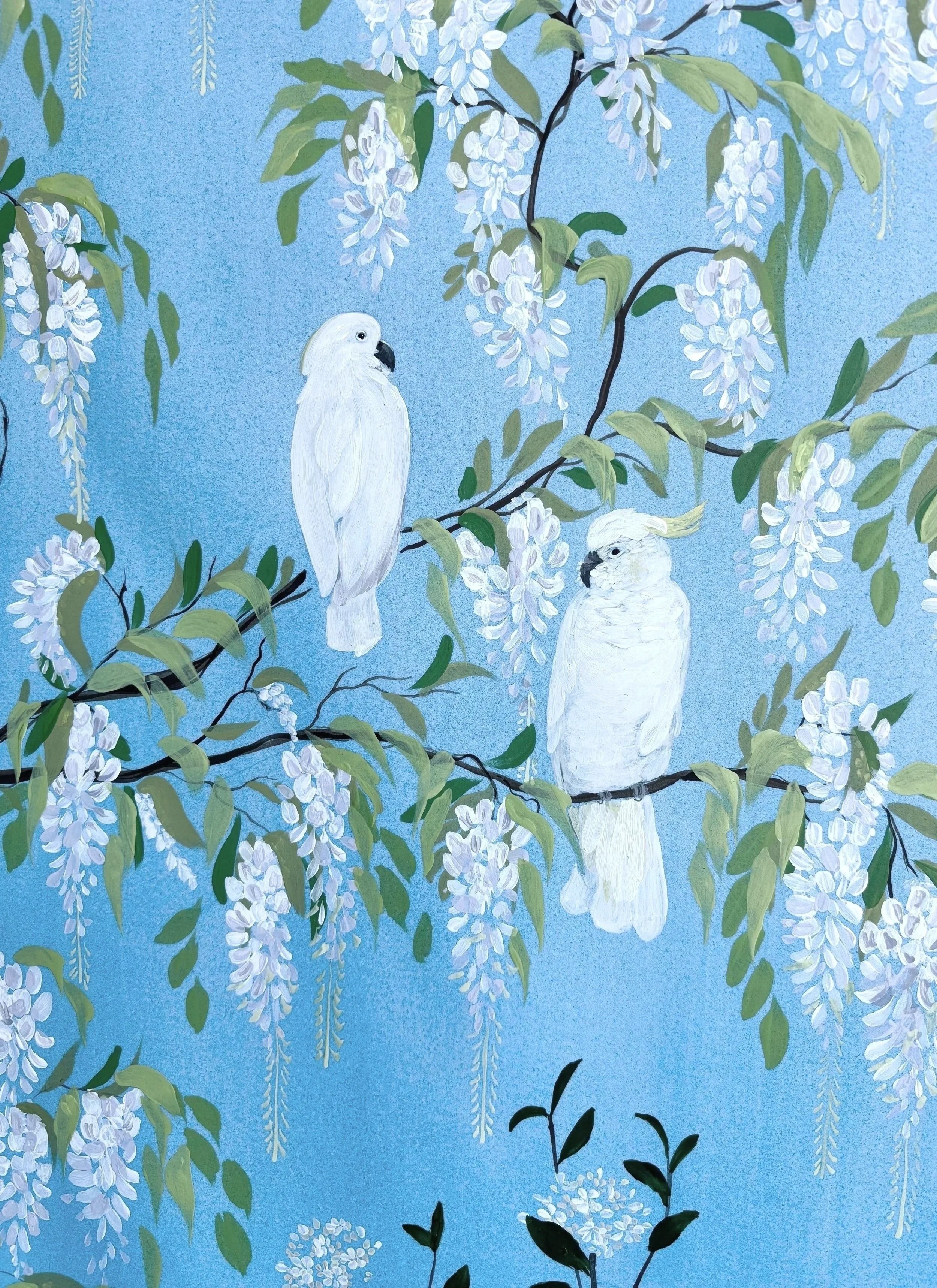
This triptych will always be one of my favourites. One main reason is I rarely ever paint this large, each panel is 22”x30” and uses a mix of watercolours and acrylic paint. I just love the way the cockatoos look surrounded by all that wisteria! The main inspiration behind this piece is wallpaper, particularly Chinoiserie wallpaper often painted on silk panels. I originally came up with this project for my own apartment, I have a deep blue, cut velvet slip-covered sofa that I adore, but it was quite a challenge to find artwork to pair with it because it is such a particular colour, and with it being velvet, the shimmer made the undertones difficult to pin down.
The way I like to break down blues is by first finding the undertone, is it leaning closer to red (warm) on the colour wheel? Or green (cool)? Blues usually lean one way or another, it’s rare to find a true, neutral blue. In my case, because the fabric is so reflective, I had a very difficult time figuring it out, so I used a paint deck and eventually came to the conclusion that it is overall a warm blue. You can see it in the highlights, they look almost lavender/periwinkle (I feel like the dark shadows are a very deep cool blue but really I just needed a general idea).
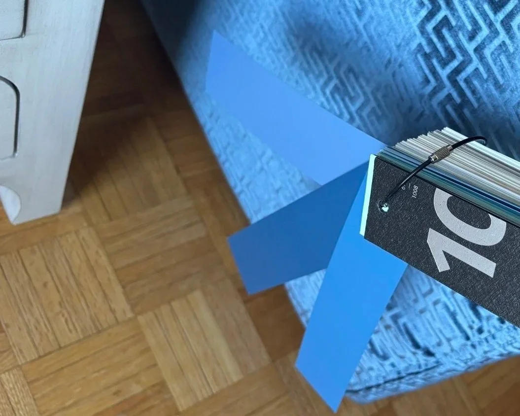
I find that a paint deck is a very useful tool when trying to nail down a certain colour. I learned this from an interior designer and very good friend of mine.
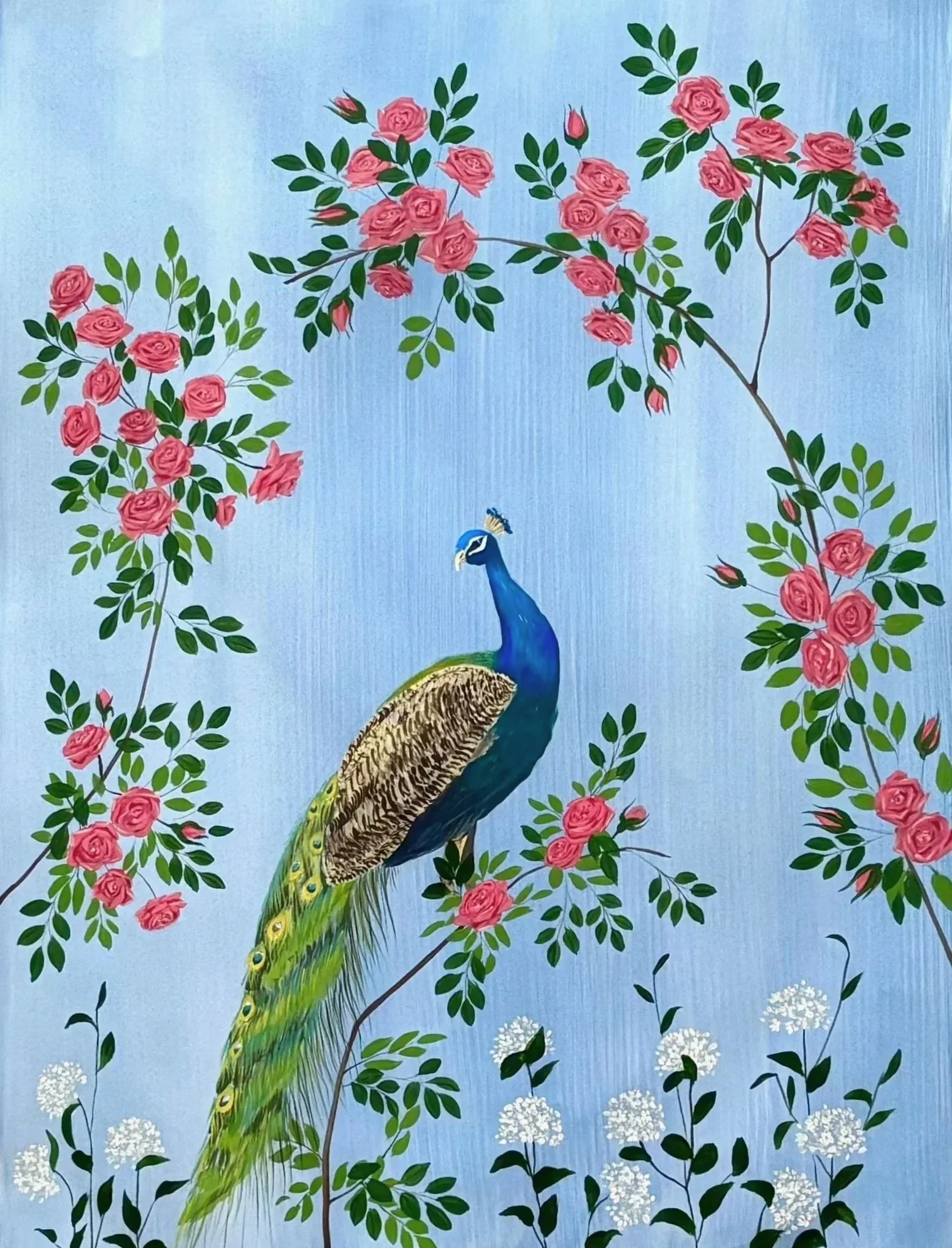
To mix my blue I used a mix of different colours because I wanted to make sure the blue was muted and not overly saturated, so I created a mix of Cobalt Blue, Alizarin Crimson, and Yellow Ochre to ‘muddy’ the colour and bring the saturation down (I must’ve thrown other paints in there like Burnt Umber, I paint the same way I cook, entirely by feel). I applied it in layers and vertical washes, as I love a stripey, not-so-perfect, colour wash for a background. After about 3-4 washes, I was quite happy with the colour on the paper so I began plotting out my trees and birds. I was tossing different ideas around for the colours of the flowers. I was tempted to do purple wisteria, and possibly pink Galah parrots, but ultimately decided to keep everything close to white.The middle panel features a peacock and pink roses, so I wanted to keep the rest simple. I spent the following few days painting everything on, making little tweaks as I went along, at one point I went in and redid all the wisteria because they were originally too small and lacked that ‘drape’ effect I had pictured in my mind. At this point I was also flirting with the idea of adding small details with gold leaf, but after testing a few samples, decided not to.
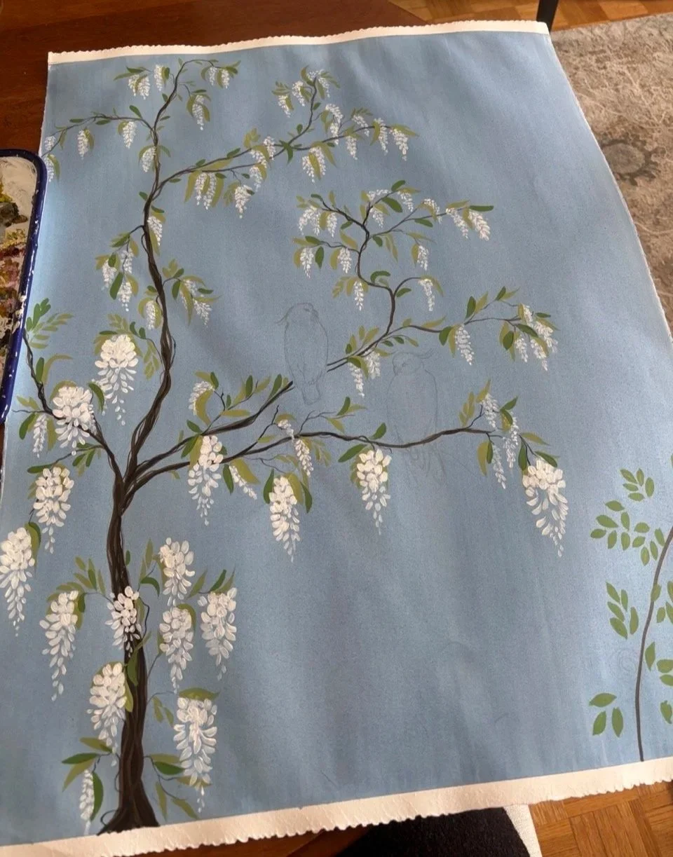
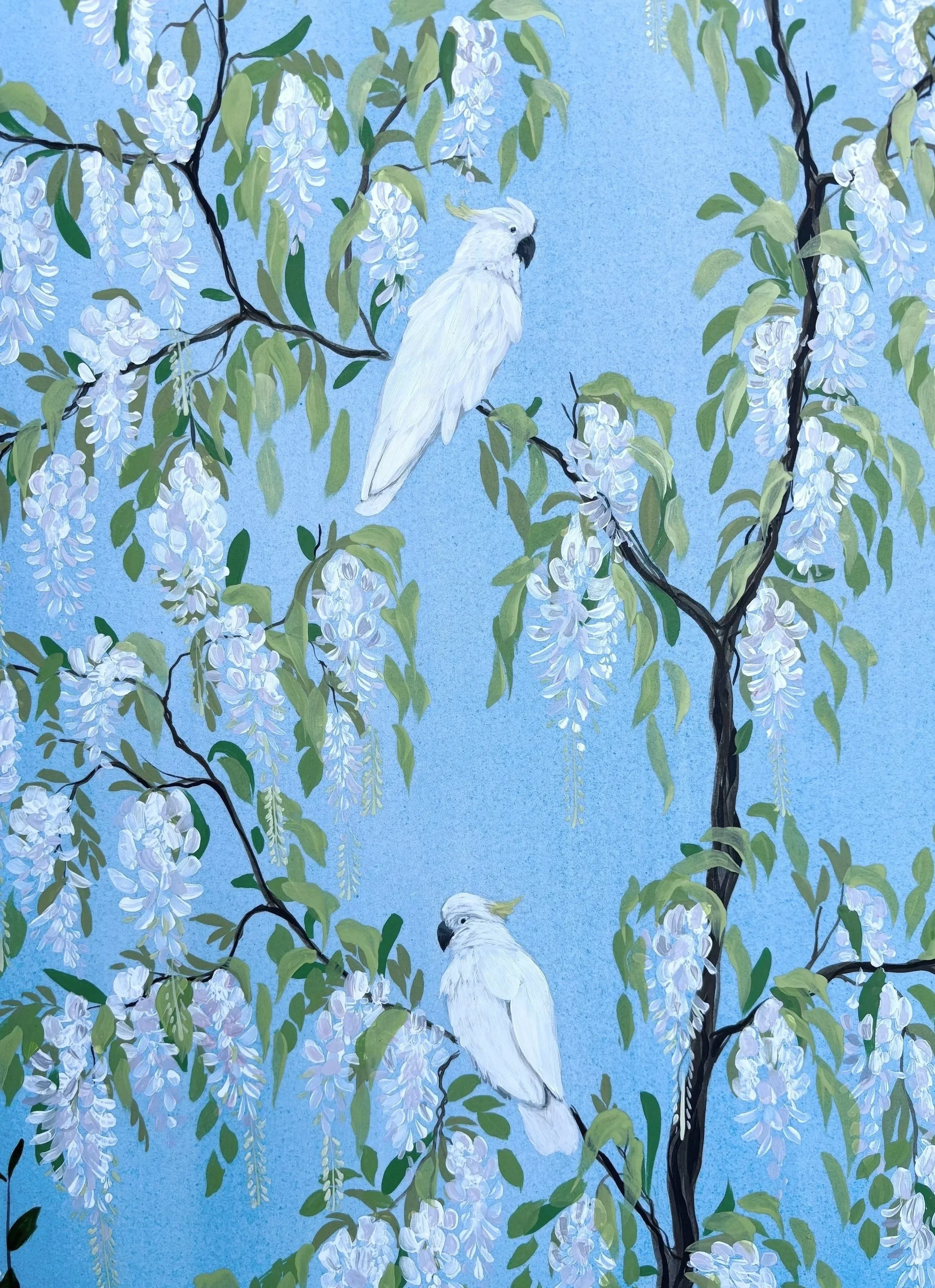
Taken in the middle of repainting the wisteria.
Eventually I reached a point where I was ready to call it done, however, when looking at it in my living room, against my sofa, I thought the colour was very good but the paintings were maybe too delicate against the strong Greek key pattern. I ended up finding something entirely different for that wall, and even though this painting didn’t end up working out for the original purpose I had in mind, it eventually found its forever home and will always be a favourite of mine.